New Widgets on the Dashboard: Bar Chart, Scatterplot, Percentage, and Speedometer
The Internet Monitor has launched a series of new widgets on the dashboard that allow you to view, analyze, and compare new data across over 100 countries! Your dashboards can now become more visually exciting and informative than ever before.
Bar Chart
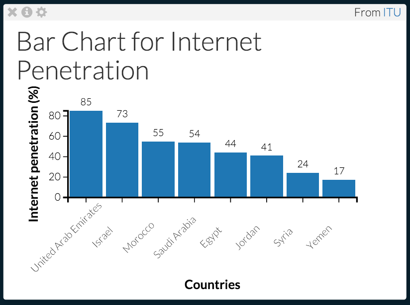
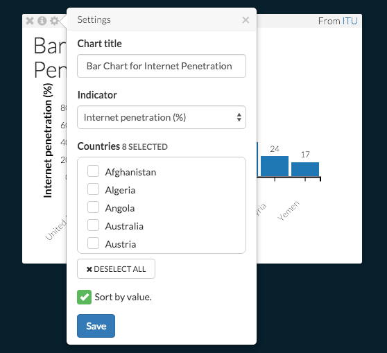
The Bar Chart widget allows you to compare data for your choice of indicators across countries, side by side. In the screenshot below on left, data available on internet penetration for several countries in the Middle East was selected. You might be surprised to see that the UAE has a higher rate of internet penetration than Israel. If you want to explore different data across different countries, just click on the settings button and adjust the “indicator” and “countries” settings as demonstrated below on the right hand side. You can also give your widget a custom title, and choose to sort the bars alphabetically or by value.
Scatterplot
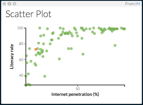
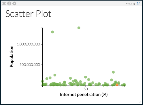
The Scatterplot allows you to compare the relationship between two indicators for all countries with available data. Below on the left the scatterplot widget is used to compare countries’ literacy and internet penetration rates. As you can see, a general correlation exists between literacy rate and internet penetration - the higher the literacy rate, the higher the internet penetration. Many data sets are included in the list to allow you to observe the relation between them. The scatterplot on the right hand side shows the relationship between population and internet penetration rates—one with no correlation. As with the bar chart widget, you can customize the title of your scatterplot, as well as the indicators on the X and Y axes.
Percentage
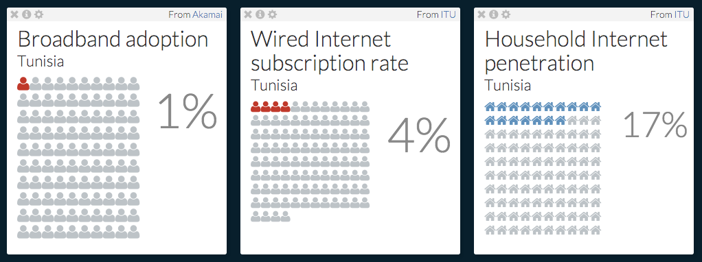
The Percentage widget allows you to add visuals to your dashboard for indicators that are measured as a percentage. Below is a dashboard that demonstrates the broadband adoption rate, the wired internet subscription rate, and the household internet penetration rate in Tunisia. Notice that some of the categories that can be chosen from in settings are categories that have different visual representations - some are represented by a house, some are represented by a person.
Speedometer
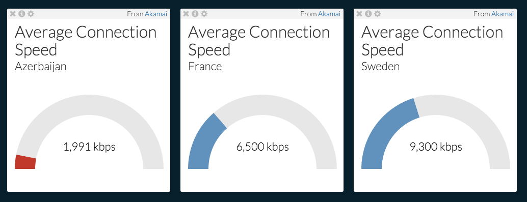
The Speedometer widget lets you examine the average and peak connection speeds and upload and download speeds of different countries. Below, the average connection speed of Azerbaijan, France, and Sweden is listed on the dashboard. The color of the speedometer can be changed as well; in this case, Azerbaijan’s speedometer was changed to red to highlight the difference in the average connection speed between its country’s connection speed and those of France and Sweden.
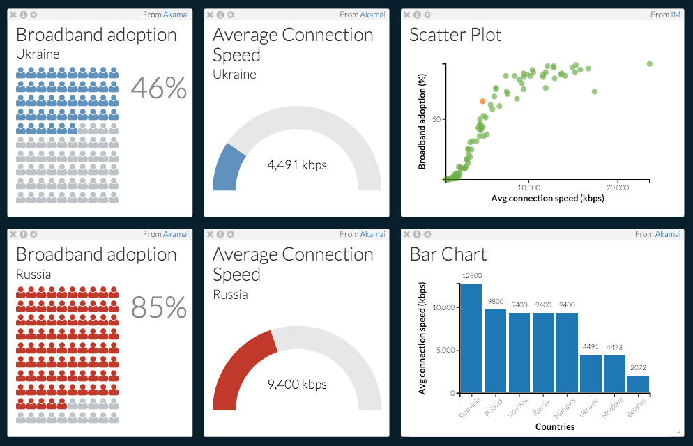
If you’re trying to gather information about a specific subject or region, feel free to curate your dashboard in a way that reflects your research interests. For example, the dashboard captured below uses a number of widgets to show the connection between broadband adoption and average connection speed in Ukraine and Russia. The bar chart shows how average connection speed in Russian and Ukraine compares with other Eastern European countries.
Don’t be afraid to personalize and experiment with your dashboard! Trying to understand the level of internet penetration for different countries in Latin America? Wondering if a country’s GDP influences average download speed? You can use these new widgets to find your answers on the dashboard.
