New Dashboard Widgets: Animated Bubble Chart, Timeline, and More!
Internet Monitor has added four new widgets to the dashboard to give users more ways to view and analyze data! Our new map, timeline, value/trend, and bubble chart widgets round out our earlier bar chart, scatterplot, percentage, and speedometer widgets with global and historical views of the dozens of different data indicators in the dashboard.
Global Chloropleth Map
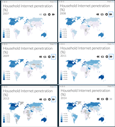
The Global Chloropleth Map allows you to compare data in countries across the map. Even better: it animates this data over time. The gif below shows a copy of the widget that is displaying data on household Internet penetration from 2007-2014. The countries with the darkest hue of blue, such as Canada, have higher percentages, whereas the lighter ones, such as India, have lower percentages. The “grey” countries, like some of the countries in sub-Saharan Africa, lack data. To change the set of data, just click on the settings button to select from a range of data indicators related to Internet adoption, speed, quality, cost, and more. The animation controls on the widget let you play, pause, loop, or step through the data year-by-year.

Timeline
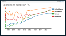
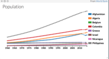
The timeline widget shows users how a particular statistic has changed over time. Users are able to select both which countries to include—each copy of the widget can fit up to 10 countries—and the desired metric.


Value/Trend
The “Value/Trend” widget displays the most recent value of a chosen data indicator from a particular country, and shows how that statistic has changed over time on a graph on the right. The screenshot below shows the timeline of GDP per capita in the United States from 1959 to 2014. Dashboard users can toggle the dataset and the country as well as the color of the line.

Bubble Chart
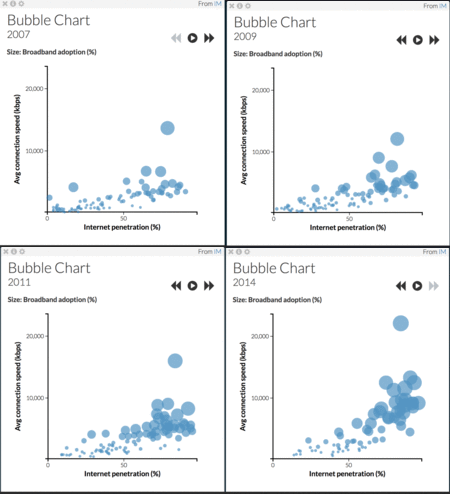
In a bubble chart, each bubble represents a particular country. The bubble chart displays three indicators: one affects the size of the bubble, while the other two are represented on the x and y axes. The chart is animated over time, showing changes in all three indicators. In the example below, internet penetration is on the x-axis, and average connection speed is on the y-axis, with the broadband adoption percentage as the size of the bubble. As with the animated chloropleth, control buttons on the widget let you adjust the animation to your liking.

We hope that you enjoy using these new tools for exploring, comparing, and analyzing data on the Internet Monitor dashboard. Questions? Comments? Let us know at info@thenetmonitor.org.