A Hackable Access Index
July 2014 | Robert Faris
At the onset of this project, we set out to create an index for countries around the world to complement the research, data, and reports that we produce. Our original intention was that this index would include data organized around three themes: access, openness/content restrictions, and use of the Internet. With considerable hard-earned humility and insights gained by this experience, we start by offering a user-configurable index that captures Internet access from several angles. We hope that in the future that we can also offer similar aggregate measures of content controls and Internet activity as additional data becomes available and as researchers devise new approaches for conceptualizing and measuring these aspects. For a discussion of the challenges of monitoring and measuring Internet activity, we wrote about that here. And for those that want to see indices that cover a broad range of Internet activity, check out the Web Index or the Networked Readiness Index.
The access index that we offer is constructed in a two-step process. The overall index is comprised of four sub-indices: Internet adoption, speed, price, and proxies for the ability of citizens to productively engage in online activity if given the opportunity: gender equality and education. Each sub-index looks at the question of access from different but interrelated perspectives. The conceptual core of the index is based on a simple economic model of individual decision making; given an individual’s income and their perceived benefits of purchasing Internet, and the availability of connectivity options, choose a connection plan at a given level of speed and price.
The adoption sub-index is constructed using four measures, three somewhat different measures of wireline connectivity (none of which is inherently better than the other) and mobile broadband subscription rates: percentage of households with Internet access, percentage of individuals using the Internet, wired Internet subscription rate, and active mobile broadband subscription rate. (All four of these indicators are drawn from the International Telecommunication Union; for more details on these and all our indicators, please see our Data page.)
The most vexing part of this aggregation is choosing a way to compare and combine wireline and wireless connectivity. For many of the digitally fortunate, wireline and wireless connectivity are both essential and complement one another. And for others, mobile connectivity is the only game in town. These two disparate versions of the world are valid approximations of reality in different contexts. This suggests that any single formula for aggregating mobile and wireline connectivity will be right in some places and wrong in others. Sorting out the pros and cons of connecting solely through mobile sources is a topic worthy of several PhD dissertations, and will still leave a number of hard questions unanswered.
The speed and quality sub-index is assembled with seven variables. Four are drawn from Akamai’s State of the Internet report: average connection speed, average peak connection speed, broadband adoption rate, and high broadband adoption rate. The latter two metrics measure the proportion of user connections that surpass speed thresholds of 4Mbps and 10 Mbps respectively. The other three variables—average download speed, average upload speed, and R-factor—are generated by NetIndex. R-factor is a measure of connection quality associated with streaming media and voice over IP telephone (VoIP).
The price sub-index is based upon a publicly available data set assembled by Communications Chambers with the support of Google. The data include more than 1,800 service plans from 90 countries. To generate an index, we separated the service plans from each country into five tiers based on the advertised download speed:
- Tier 1: <= 1 Mbps
- Tier 2: >1 to 4 Mbps
- Tier 3: >4 to 10 Mbps
- Tier 4: >10 - 25 Mbps
- Tier 5: > 25 Mbps
The service plans for each tier for each country are aggregated into an average price, and then converted into a proportion of per capita income to serve as a measure of the affordability of broadband in each country. The overall price sub-index for each country is formed by taking an average of the cost of each tier after normalizing the scores within each tier across all countries, which permits us to compare scores across countries that do not offer plans in each of the speed tiers. For the data, our calculations, and further description, please see our Data page.
The fourth and final sub-index, the education sub-index, which is intended to capture elements of both education and gender equality, is comprised of three metrics: the overall literacy rate, and the proportion of females and males that complete secondary school.
We feel reasonably confident that the metrics that we’ve chosen are amongst the best available with coverage of a large number of countries and that the four sub-indices capture important elements of Internet accessibility. We are not as confident in the relative weights that should be assigned to each sub-index. Hence we leave it to you to experiment with the different weights or to take the raw data and create your own index. As described later, we see this data aggregation exercise as a starting point for exploring these factors in more detail and for formulating further research questions and not an as authoritative measure on the state of Internet accessibility across different countries.
Using equal weights across the four sub-indices, East Asian and European countries make up the top ten. The order of countries is somewhat sensitive to changing the relative weights of the sub-indices. For example, Hong Kong will surpass Denmark if one places a greater emphasis on speed and less on education. However, the general position in the ranking of the 90 countries varies little by changing the importance of adoption, price, speed, and education. Those that perform well overall tend also to perform well in each of the four sub-indices.
| Country | Adoption sub-index | Speed sub-index | Price sub-index | Education sub-index | Overall index |
|---|---|---|---|---|---|
| South Korea | 0.90 | 0.92 | 0.92 | 0.89 | 9.06 |
| Denmark | 0.89 | 0.56 | 0.97 | 0.99 | 8.52 |
| Hong Kong | 0.79 | 0.84 | 0.97 | 0.79 | 8.49 |
| Japan | 0.88 | 0.71 | 0.92 | 0.87 | 8.44 |
| Finland | 0.91 | 0.47 | 0.95 | 1.00 | 8.31 |
| Netherlands | 0.84 | 0.63 | 0.93 | 0.92 | 8.29 |
| United Kingdom | 0.80 | 0.50 | 0.99 | 0.99 | 8.19 |
| Switzerland | 0.77 | 0.60 | 0.93 | 0.97 | 8.17 |
| Sweden | 0.89 | 0.54 | 0.94 | 0.89 | 8.16 |
| Singapore | 0.83 | 0.65 | 0.93 | 0.81 | 8.06 |
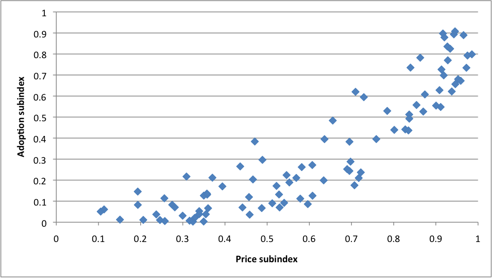
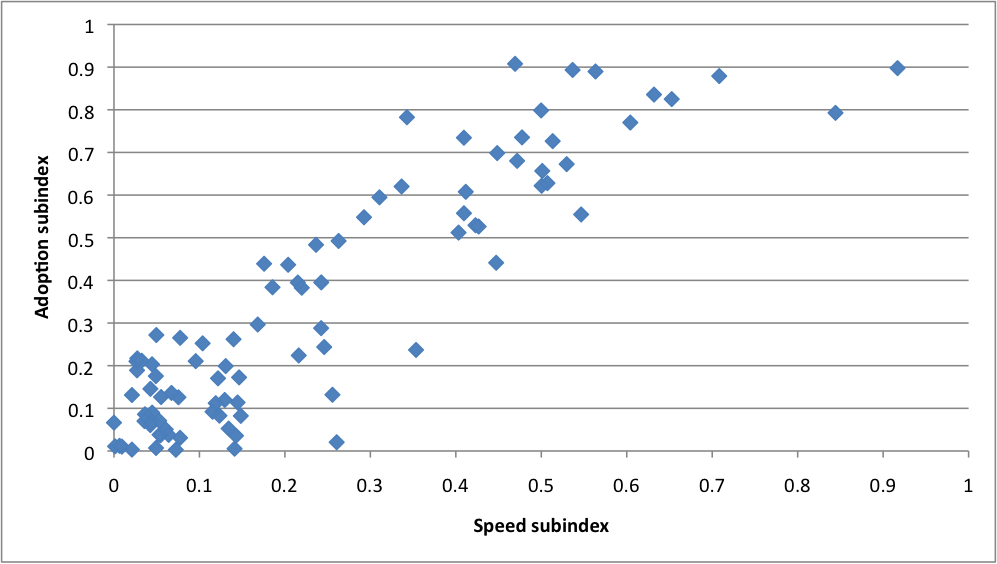
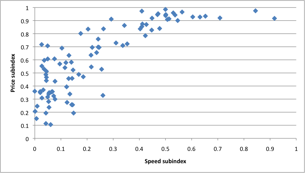
If one were to choose a single outcome measure, then one of the adoption metrics (often described as Internet penetration) is probably the best bet, as this is a useful stand-alone metric that reflects the other sub-indexes. As we see in the scatter plots below, adoption, price, and speed move together in a consistent pattern.
There are different ways of interpreting the role of affordability. From one perspective, the price of broadband access is an input into adoption decisions—higher prices inhibit adoption. However, there are also scale effects at play that might reverse the causality: where adoption is higher, economies of scale in deploying infrastructure translate into lower provision costs. As seen in the figure below (each point is a country with its corresponding adoption and price score), we see that there is strong relationship between prices and adoption across countries: better (lower) prices are correlated with higher adoption rates.

We include broadband speed and quality measures to incorporate the variation in connectivity options across different countries and regions. Speed and adoption are also positively correlated, though the interaction is complex enough to preclude us from drawing conclusions about causality. In some cases, broadband speed is a hard constraint set by ISPs, where, for example, the only offerings are low bandwidth DSL, mobile, or satellite connections, or even set by the government, as in the case of Iran. In other contexts, the speed metrics are influenced by individual choices—some will opt for 1 Gbps connection option that will boost average speed scores, while others will opt for the slower, less expensive alternative. A reasonable assumption is that everything is part of the same endogenous stew.

Speed and price are also positively correlated—across different countries speed increases while affordability improves, which is to say that consumers in wealthier countries where there have been greater investments in broadband infrastructure have better quality access at prices better suited to their income. There is greater price variation among countries with connectivity speeds at the lower end of the spectrum, some much more expensive than others. The prices in many countries are outside the reach of a great majority of the population.

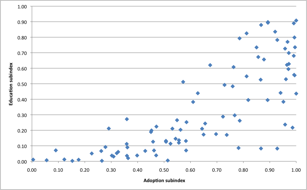
Pulling in the fourth education sub-index, it is evident that this too is correlated with adoption, but with considerably more variation. By these measures, countries at medium to high levels of educational achievement have quite different levels of Internet adoption. Many countries that do quite well at education (at least by these measures) have not yet seen broad-based adoption of broadband.

As a rough cut at overall country performance, this access index seems to do quite well, and is robust to different weighting schemes. This stems in part from the fact that those countries at the top of list do well in every category, and the lowest performers similarly score poorly across all the criteria.
Reflecting on Indicators
A significant portion of our understanding of the comparative performance of countries around the world on different topics of public importance is based upon summary indicators. If we want to know the relative wealth of a country, we can choose from a set of standard measures that reflect income per capita. As a proxy for health, life expectancy is a common metric. For education, years of schooling or proportion of the population with an elementary, secondary, and college degrees are likely candidates. If we want to know about freedom of the press, corruption, transparency, competitiveness, or accountability and transparency, there’s an index for that.
There is considerable value in well-conceived and ably constructed country-performance indices. A summary comparative number that captures a range of complex dynamics can make the underlying issues more easily accessible to policymakers, media reporting, and the general public. In this way, a good index can contribute to improving transparency, accountability, and governance. Indices may provoke public debates, and may help to motivate advocacy and policy reform efforts. The generation of indices can also serve as an impetus for investments in better understanding and communicating important public policy questions as well as promoting the collection of better data and inspiring new research.
At their best, indicators offer a mechanism for aggregating information that enable the consistent comparison of country performance across time. There is also the danger that these summary metrics obscure key differences and variation if not fundamentally mismeasuring and misrepresenting issues of critical importance to human wellbeing. These scores are a source of national pride and chagrin. The validity and accuracy of these various measures of country performance are also hotly contested, which is in part a testament to their influence as well as recognition that the foundation of these indices is not bedrock.
One measure of the value of an index is whether it contributes to a broader appreciation and understanding of the issues it covers: does it illuminate more than it obfuscates, inform more than it misleads? If picked up by the media, an index may provide a useful tool for periodically highlighting and raising awareness of chronic public policy issues that do not get adequate public attention. Country indicators may come to the attention of policy makers who are sensitive to the implicit criticism of receiving a bad score and who may look for ways to improve their standing, which would also coincide—one would hope—with necessary and useful public policy reform.
Two steps underlie country indicators: selecting the component parts and assigning weights to each. Both steps are vulnerable to errors in measurement and judgment. Some versions of index building are aptly described as meta-analysis in which analysts combine several sources of information on the same topic seeking to increase the reliability of results: think Nate Silver combining different political polling numbers. More commonly, an index combines dissimilar things and necessarily obscures underlying details in order to offer more accessible insights into multifactorial issues. The Human Development Index (HDI) is a widely cited example of such an indicator. The motivation for producing the HDI was to offer an alternative to GDP that measures human wellbeing based on more than income alone. HDI combines GDP, education, and life expectancy and shows some countries in a new light, particularly those that have well educated citizens that live long lives even where incomes are not particularly high.
The HDI is a great example of the strength of indicators in reframing issues in public debates and the potential pitfalls. Richard Posner articulates common misgivings of indices in his critique of the HDI: “The obvious objection is to the equal weighting of the three indexes, and to the omission of a host of other important dimensions of development, such as housing quality, pollution, tax rates, adult life expectancy, crime rates, unemployment, inflation, quality and variety of goods and services, economic growth, and quality of education--though including them would exacerbate the weighting problem, and some involve serious measurement problems.” Hoyland, Moene, and Willumsen emphasize the ill effects of not properly considering uncertainty in the construction of indices, which in their view leads to the “tyranny of international index rankings.” They also point out the perils of “rank seeking” behavior by policy makers as a potential impediment to better policy formulation. Michael Freudenberg offers a fine overview and critique of country performance indicators, outlining the principle challenges to the capture and representation of complex dynamics in a single metric: selecting the right variables, standardizing these variables, and choosing appropriate weights for aggregating the variables into an indicator.
Selecting the elements to include in an index is an inexact science at best. In some applications, there may be a quantitative and theoretically strong basis for determining weights. In other cases, the selection of weights is a highly subjective process based on the judgment of the analysts producing the index. We must recognize that country indicators are useful and flawed, though rigor and attention can improve their reliability. Freudenberg offers a perspective on country performance indicators that is useful if not universally heeded: “composite indicators should be identified for what they are—simplistic presentations and comparisons of country performance in given areas to be used as starting points for further analysis.” We hope that this access index will be just that.
Explore the Internet Monitor Access Index or download the data:
(last updated July 1, 2014)
- IM Access Index Data (CSV)
- IM Broadband Pricing Data (CSV)
Read our report about the challenges of measuring Internet activity.